The problem:
Björk, being a huge inspiration in art and design, creates dissonant, often difficult music to listen to. The challenge of conveying the beauty one hears in her art, and how to generate curiosity in an artist that deserves much more attention, was tackled.
Solution:
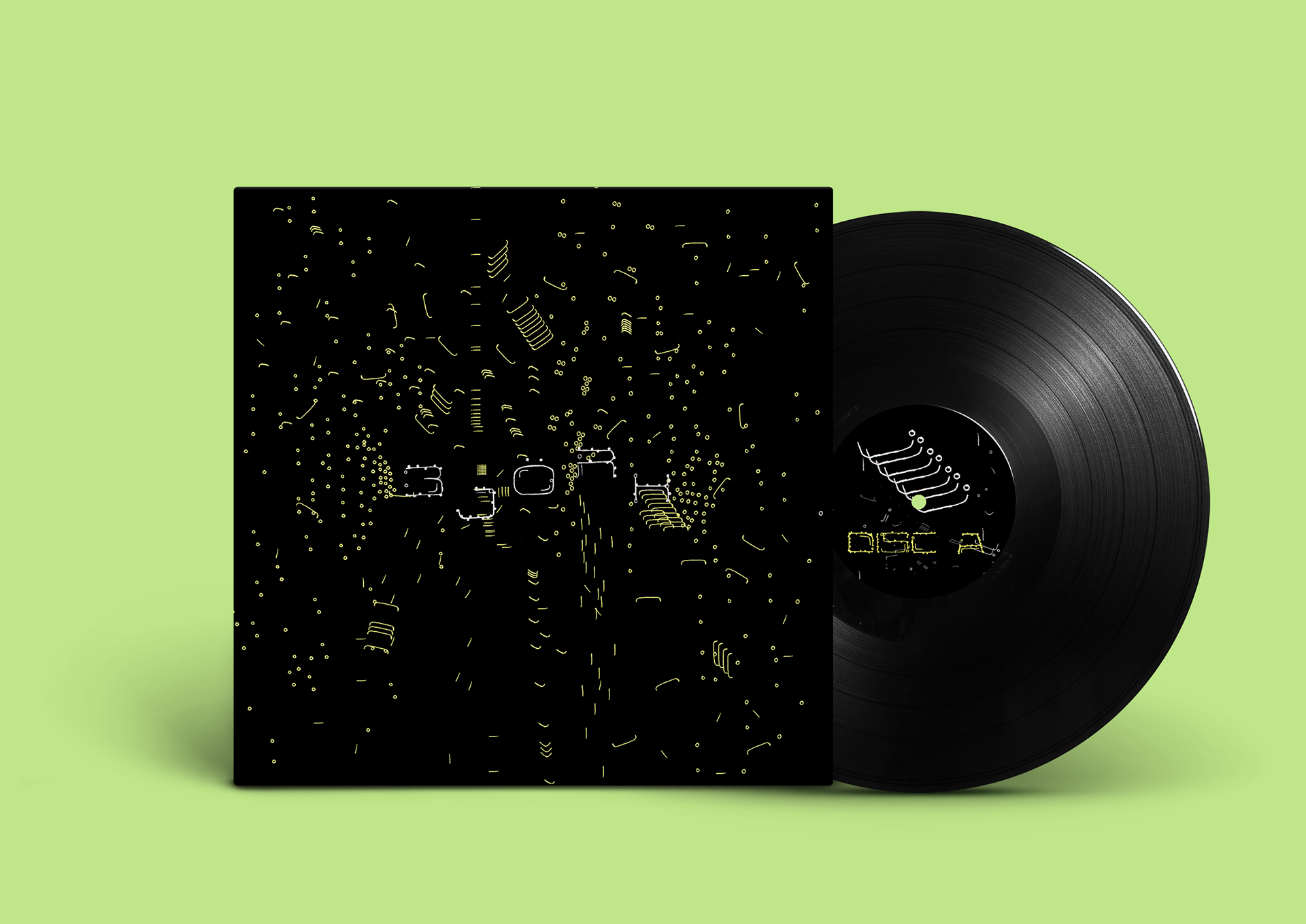
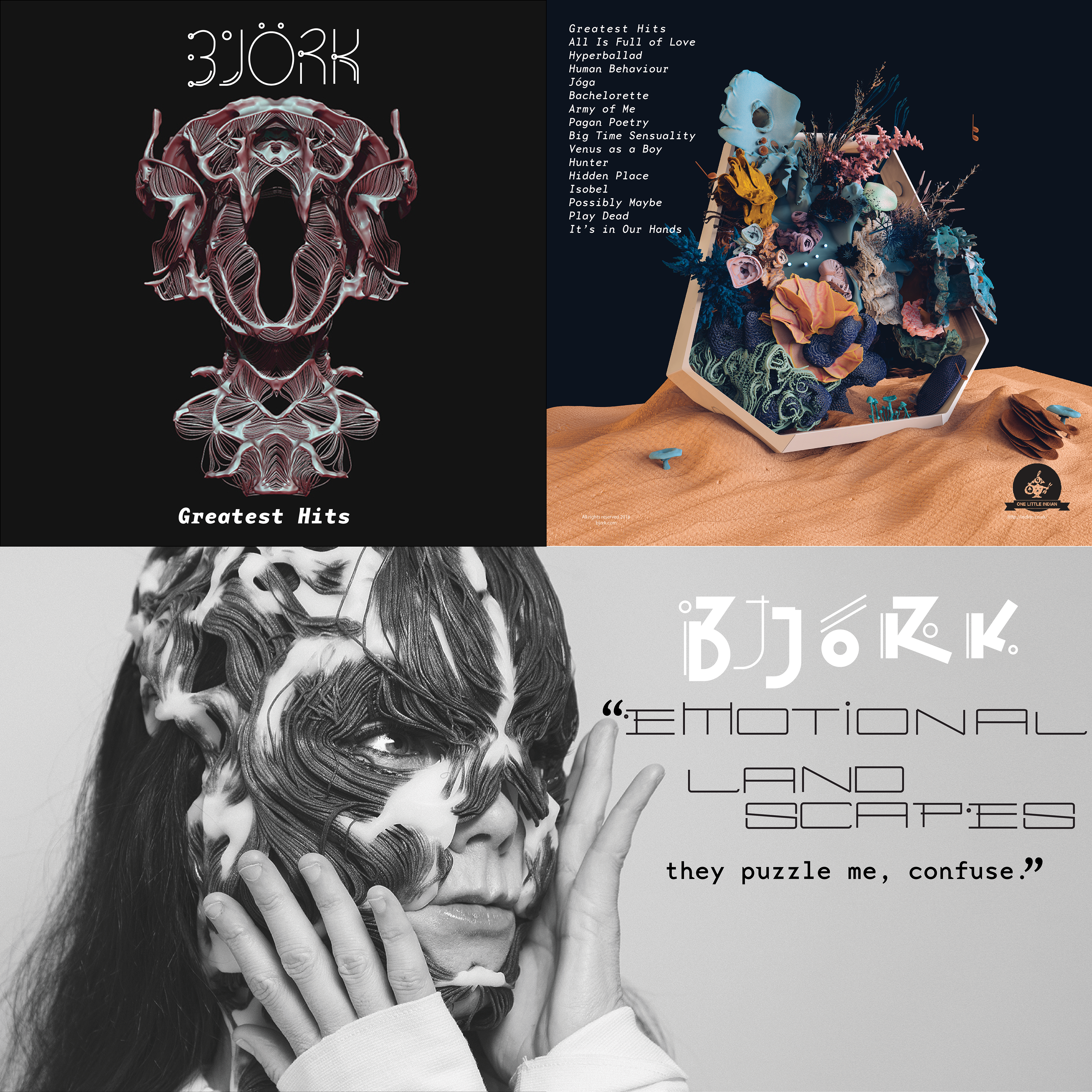
Björk blurs the lines of different genres with her music while, usually, giving nature a feature—which was the inspiration for the lettering. The 'fungus' to meant to eventually spore off and completely break into single forms that blur the line between type and art.
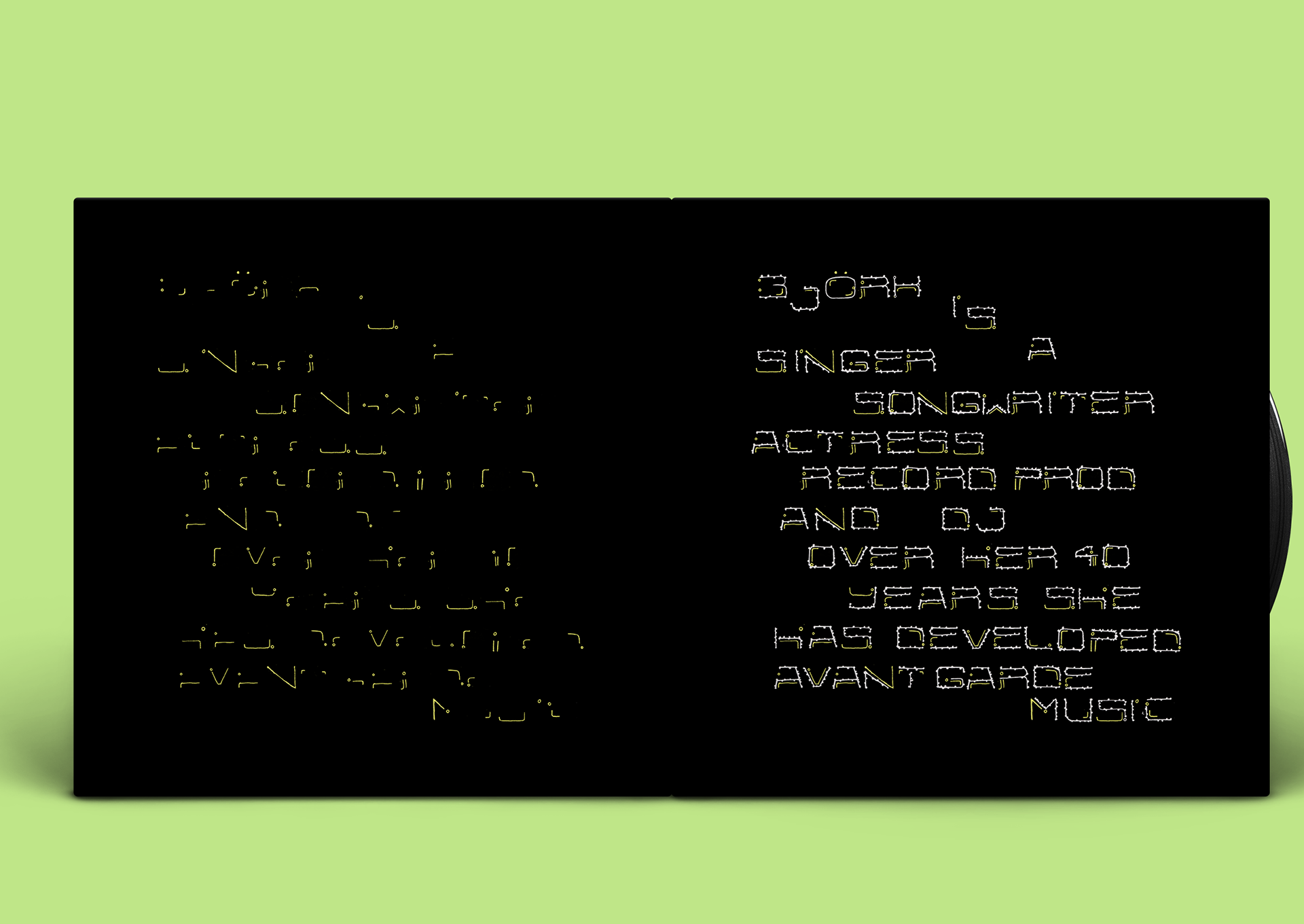
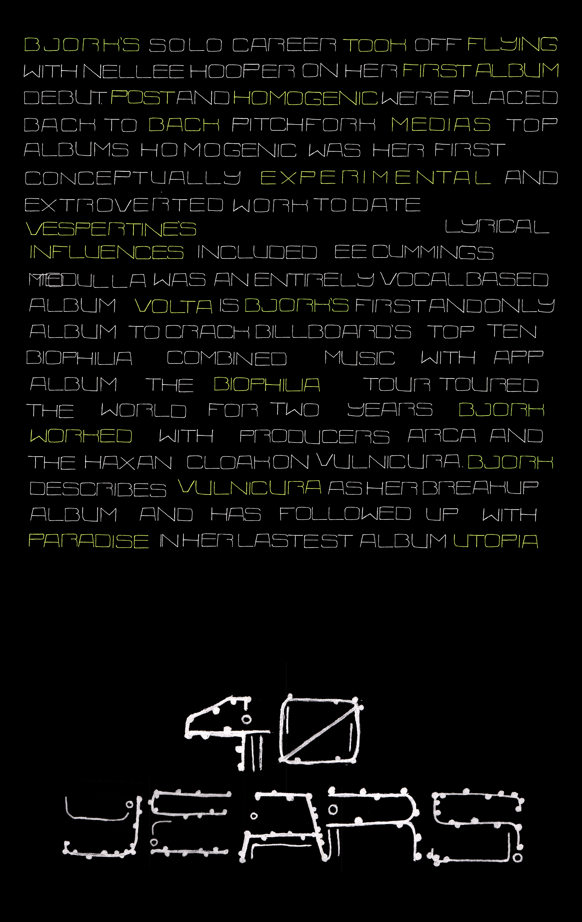
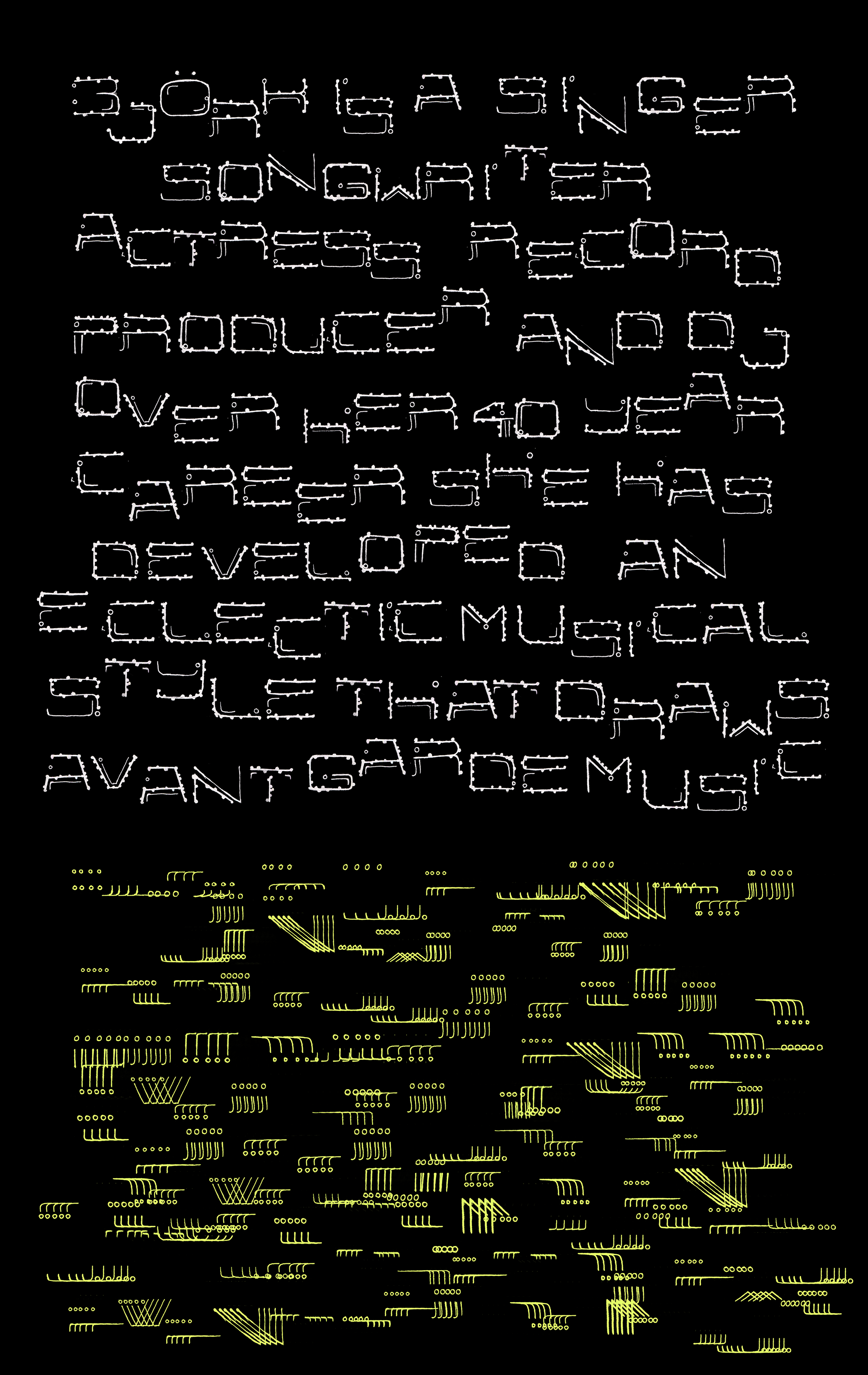
The act of opening the vinyl conceptually 'rips' the spores off of the typography on the inside of the record, revealing a biography about Björk's 40 Year Career.
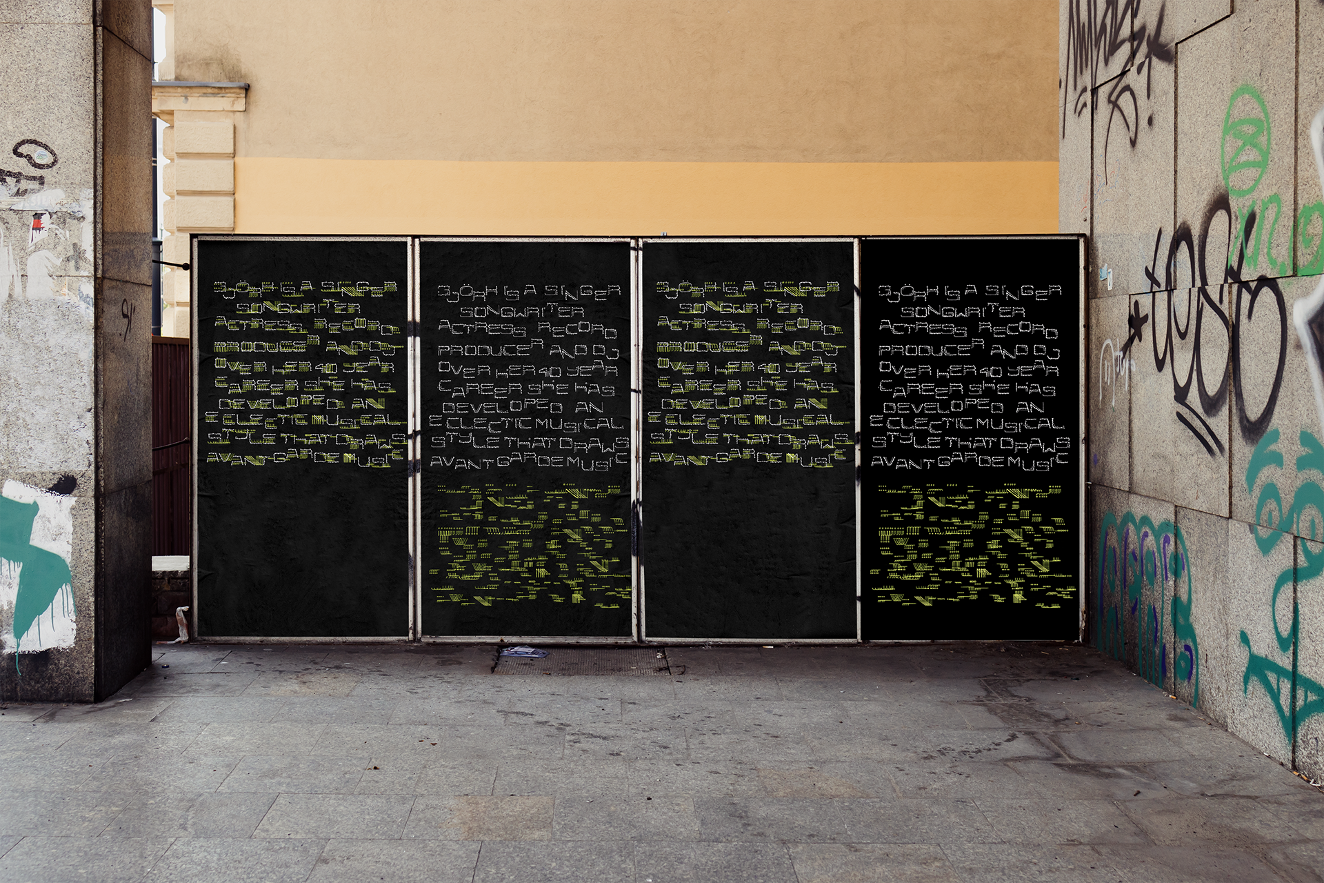
Advertisements that ‘animate’ as you walk by. Initially illegible, the spores deteriorate to achieve legibility.
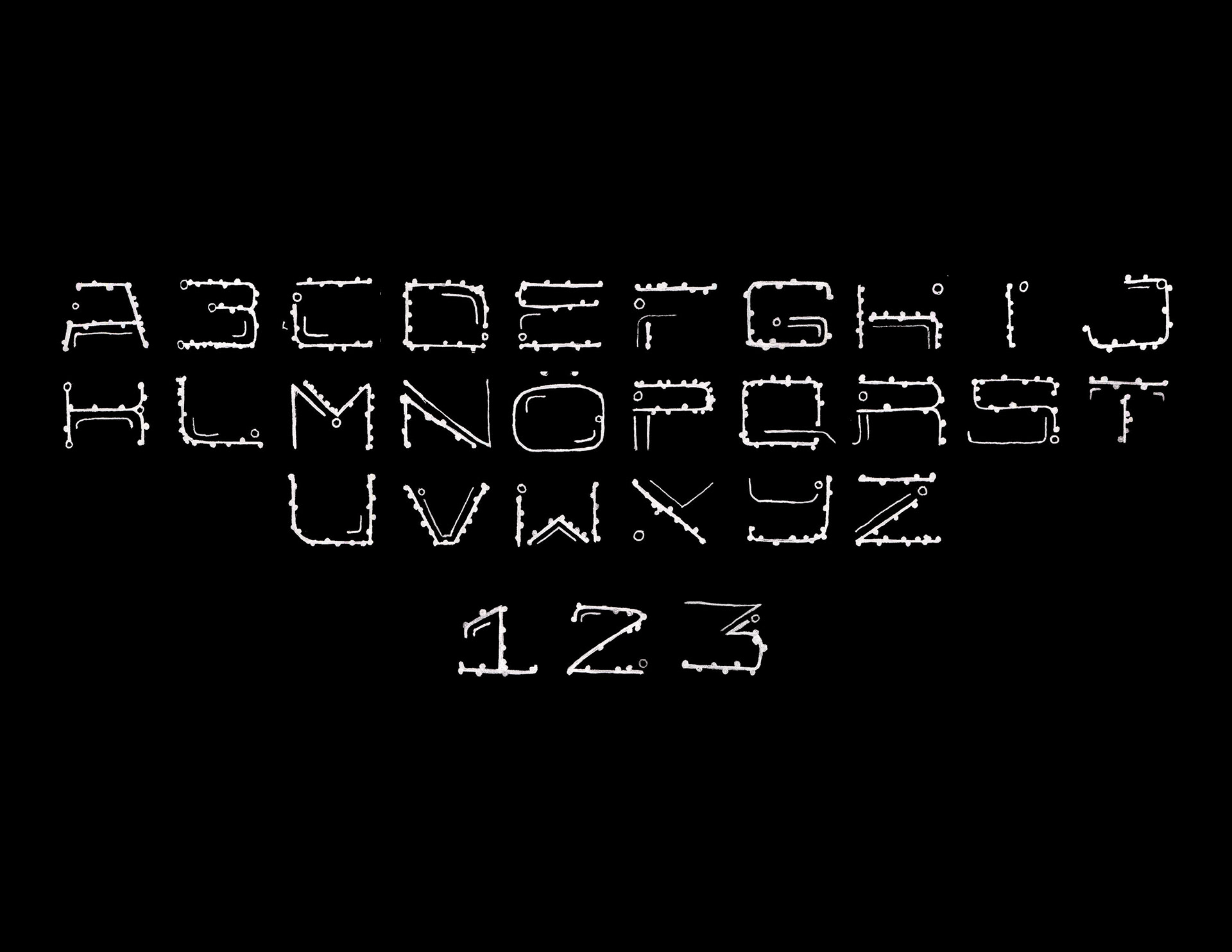
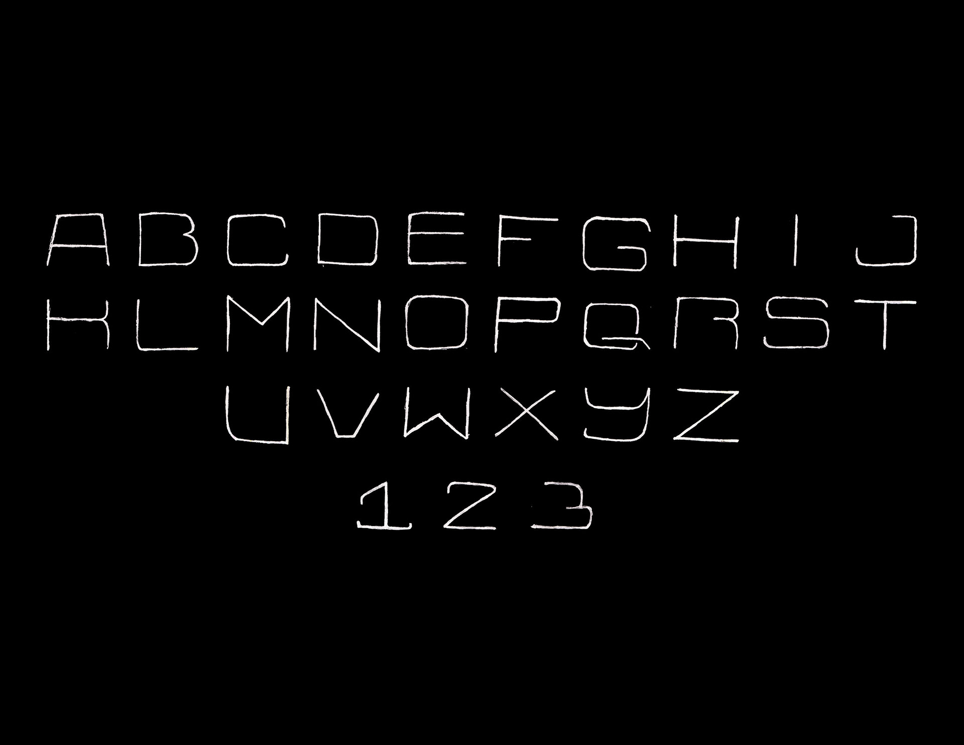
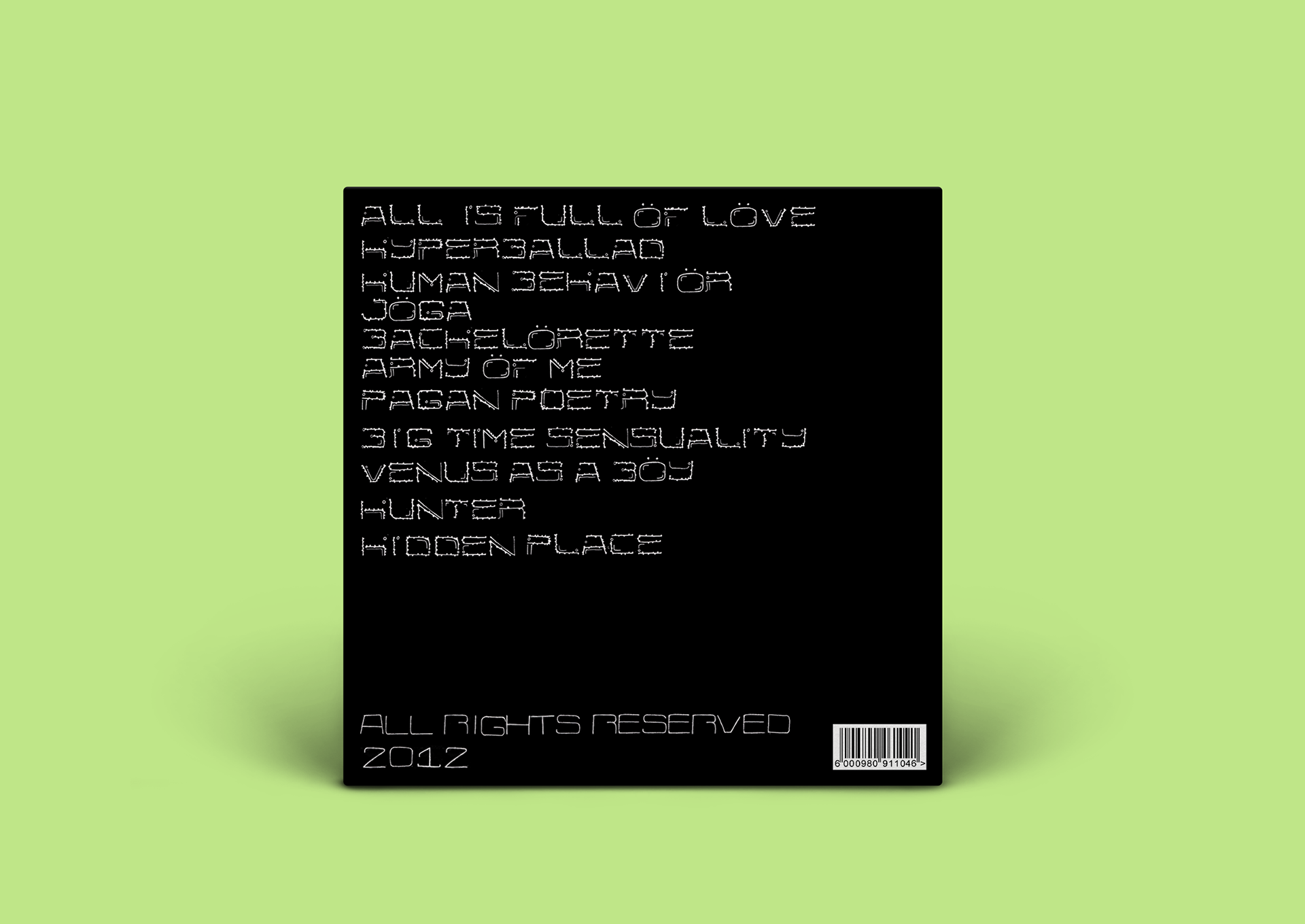
The alphabet I drew by hand titled, Metamorphosis on the left, has a compatible variation of 'Sans Fungal' type.
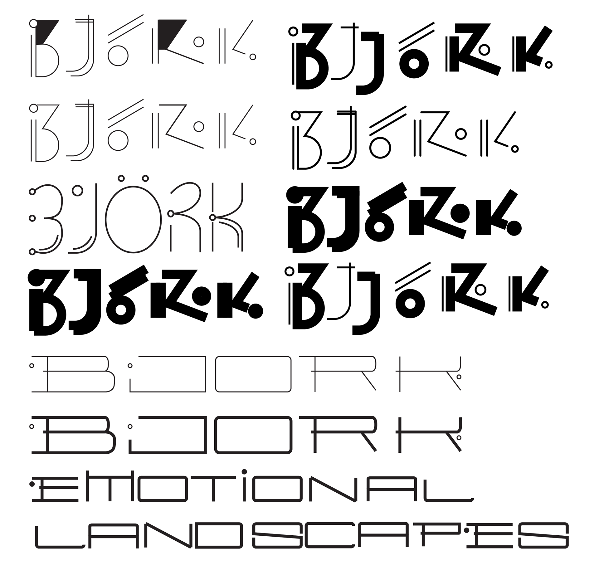
In my initial experiments, I did a pairing of photography and typography, but then I realized the typography should speak for itself. Vector graphics felt too clean for music with distortion.