The problem:
After four years of working as an individual with a freelance practice, the opportunity to open an online store under the name Zabardast Co. was taken. Under this brand: posters, merch, and miscellaneous personal projects will be housed.
Solution:
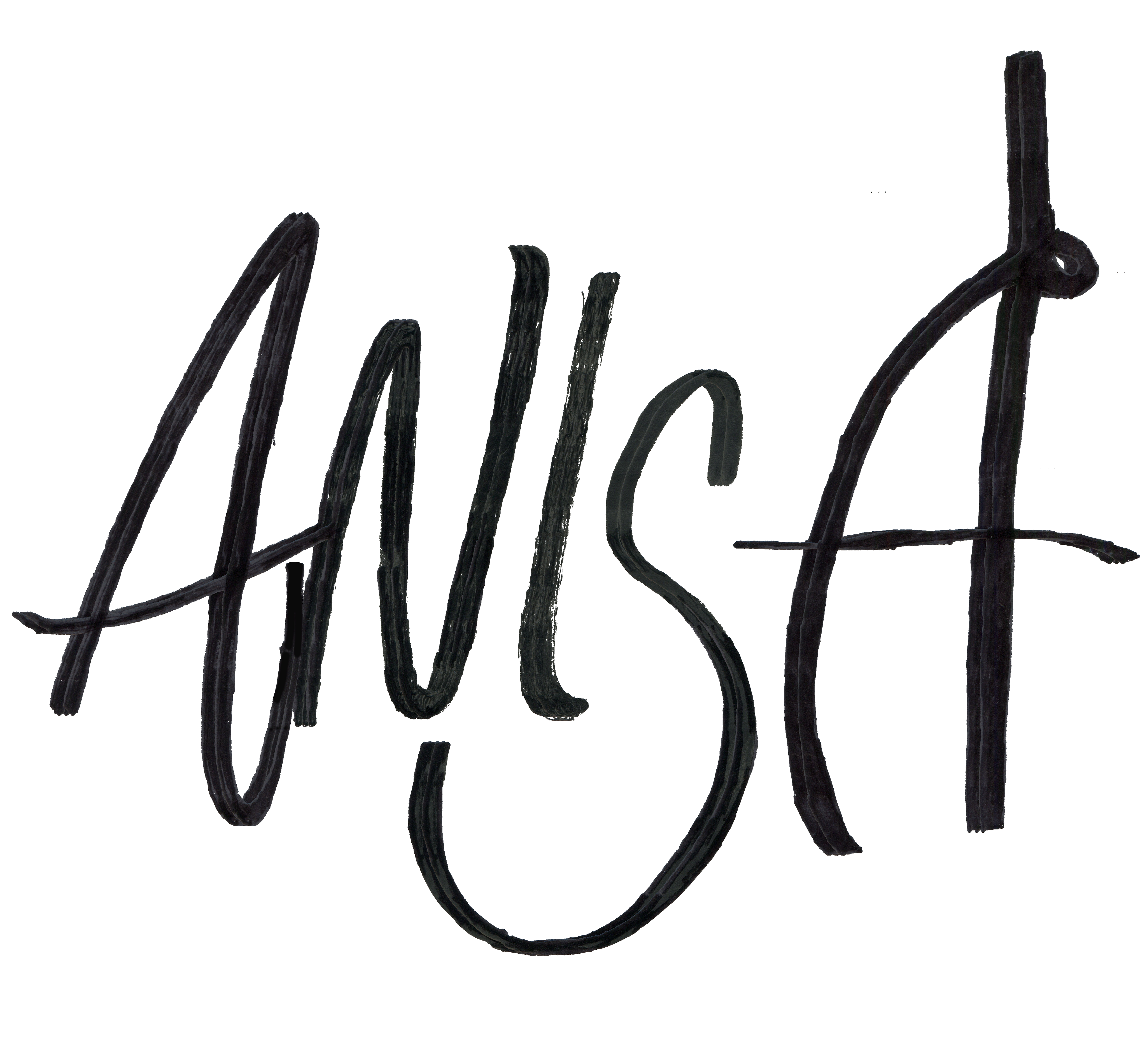
The new logo for Zabardast Company addresses the duality of working as a Pakistani-American, by intentionally splitting the name across two languages. Zabardast, meaning great, or fantastic in Urdu, references conversations had at home that are conspicuously more reflective of our unique point of view.
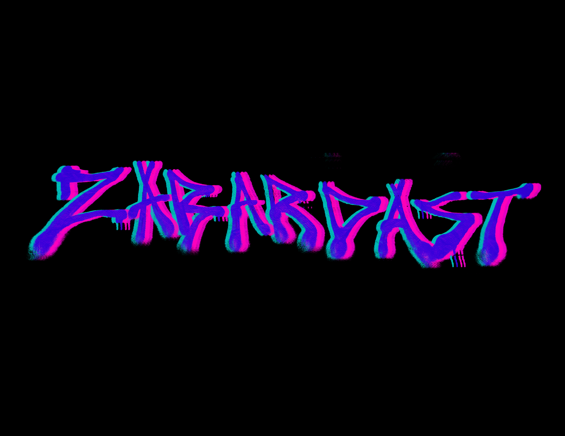
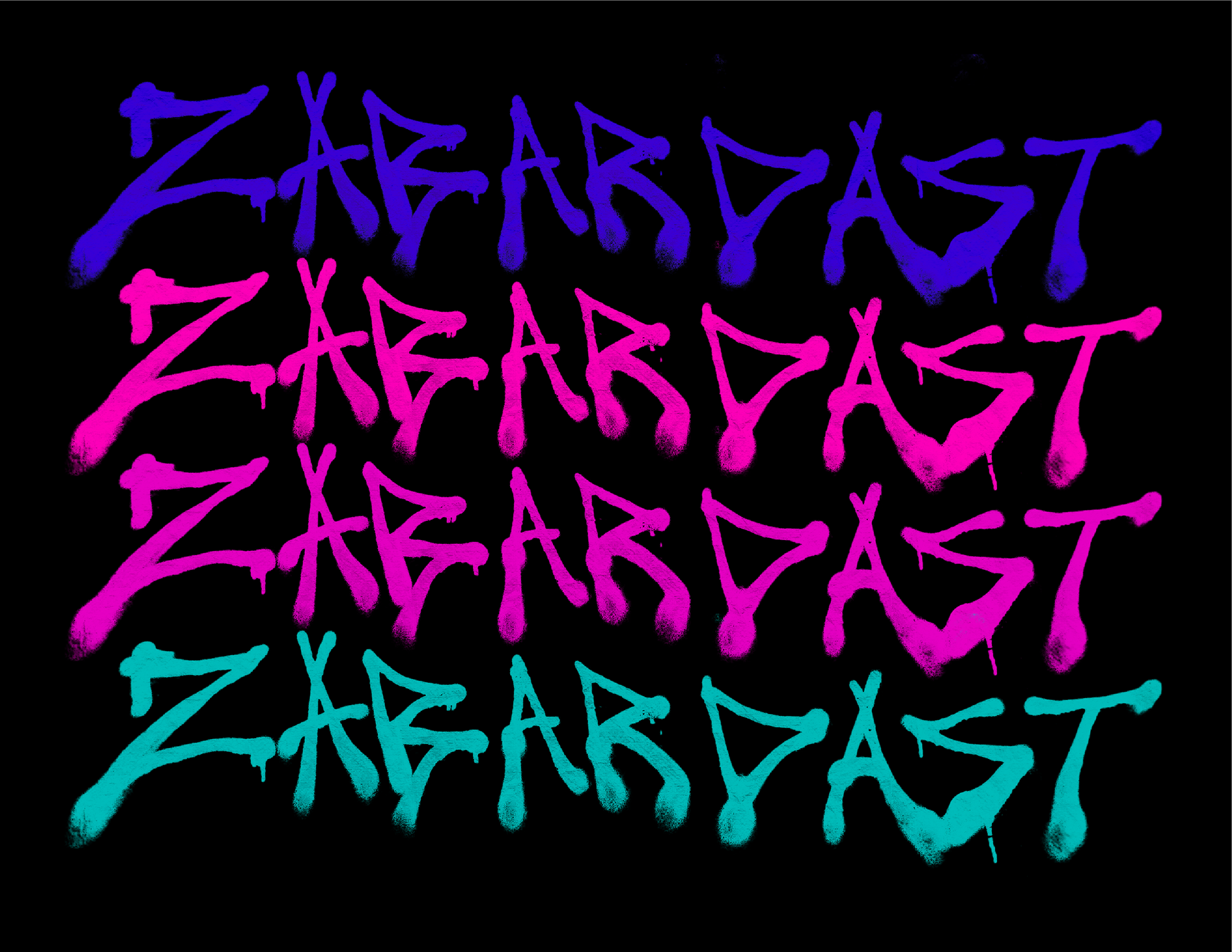
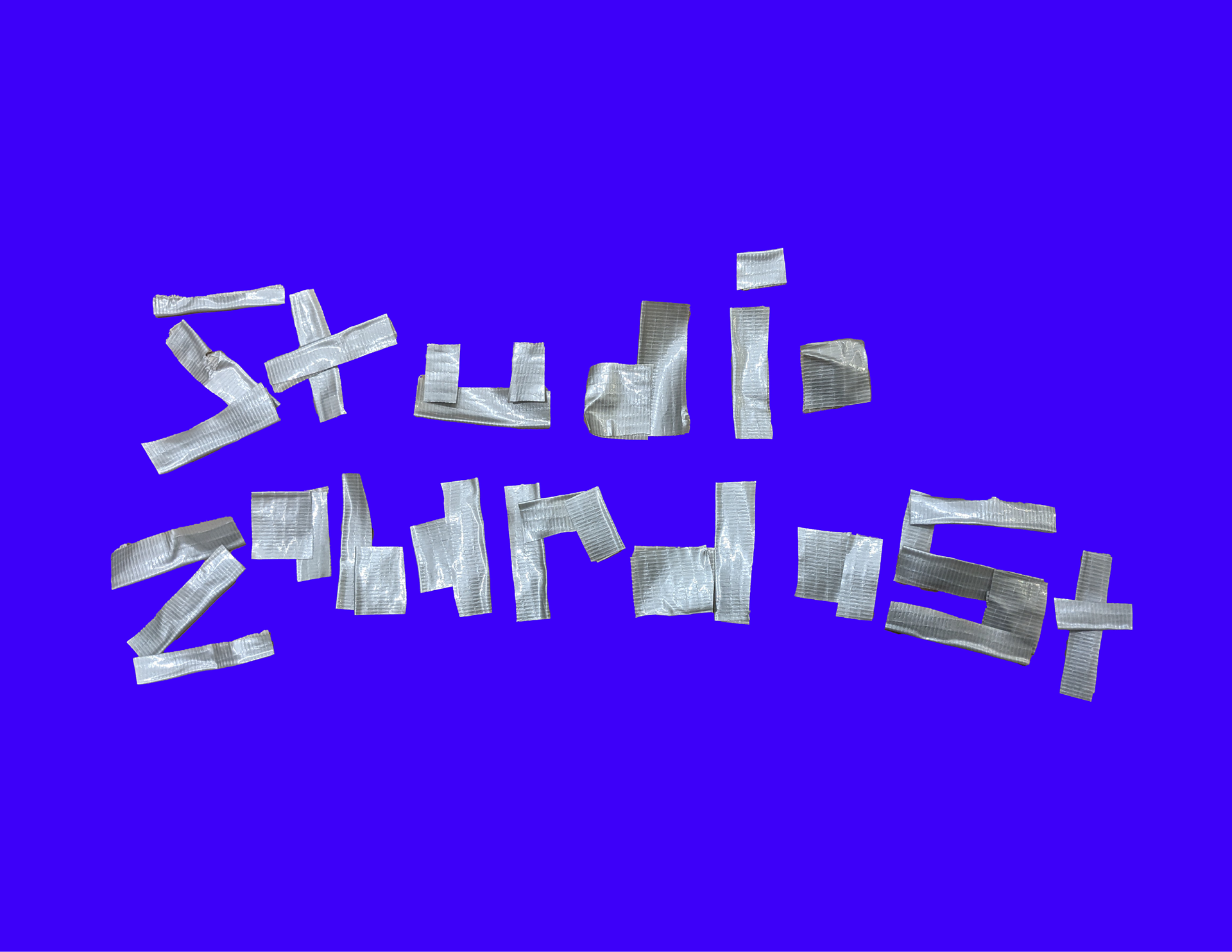
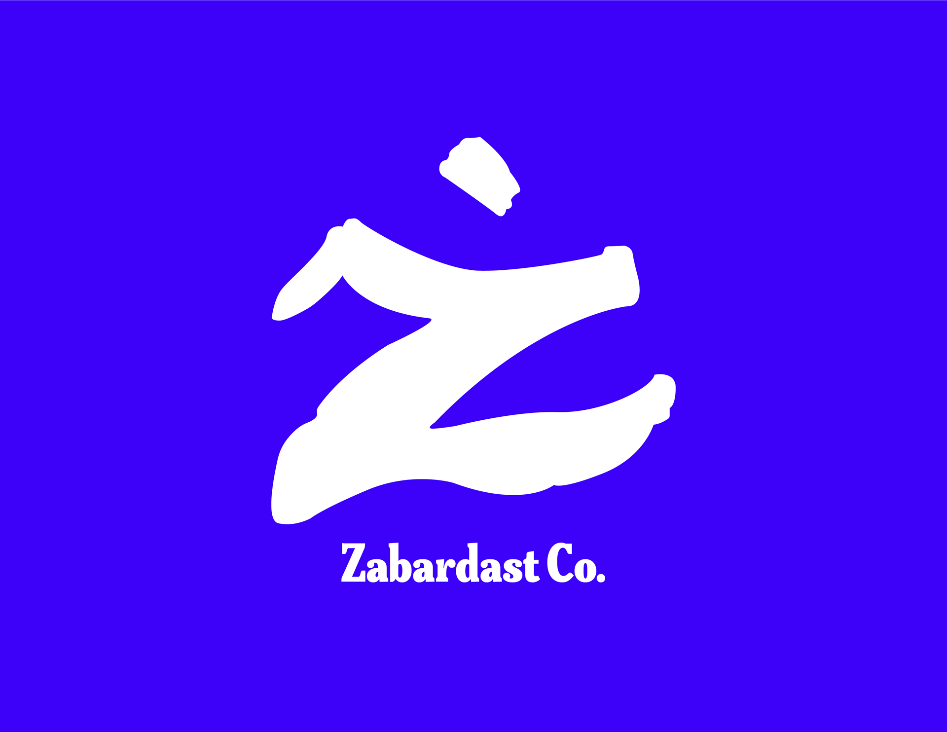
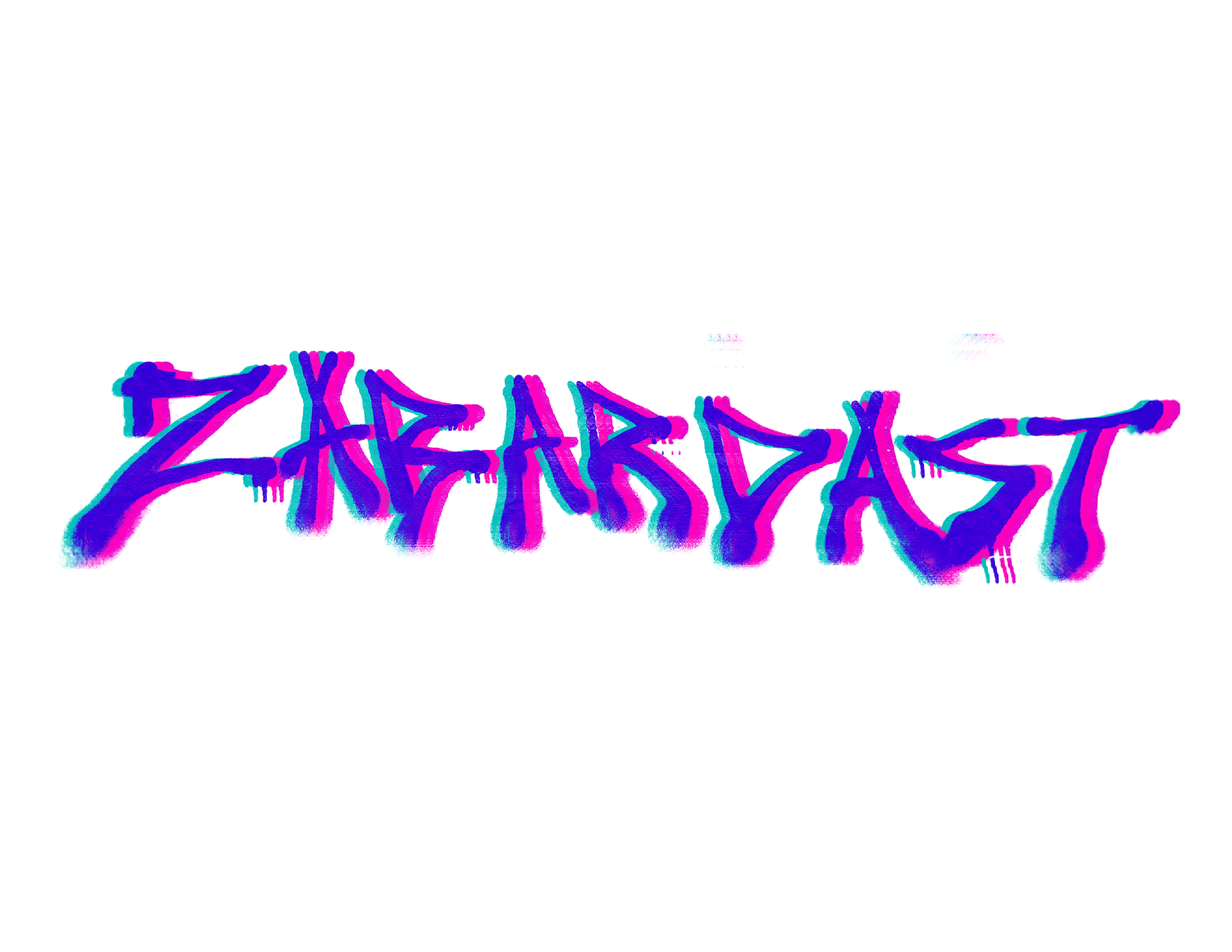
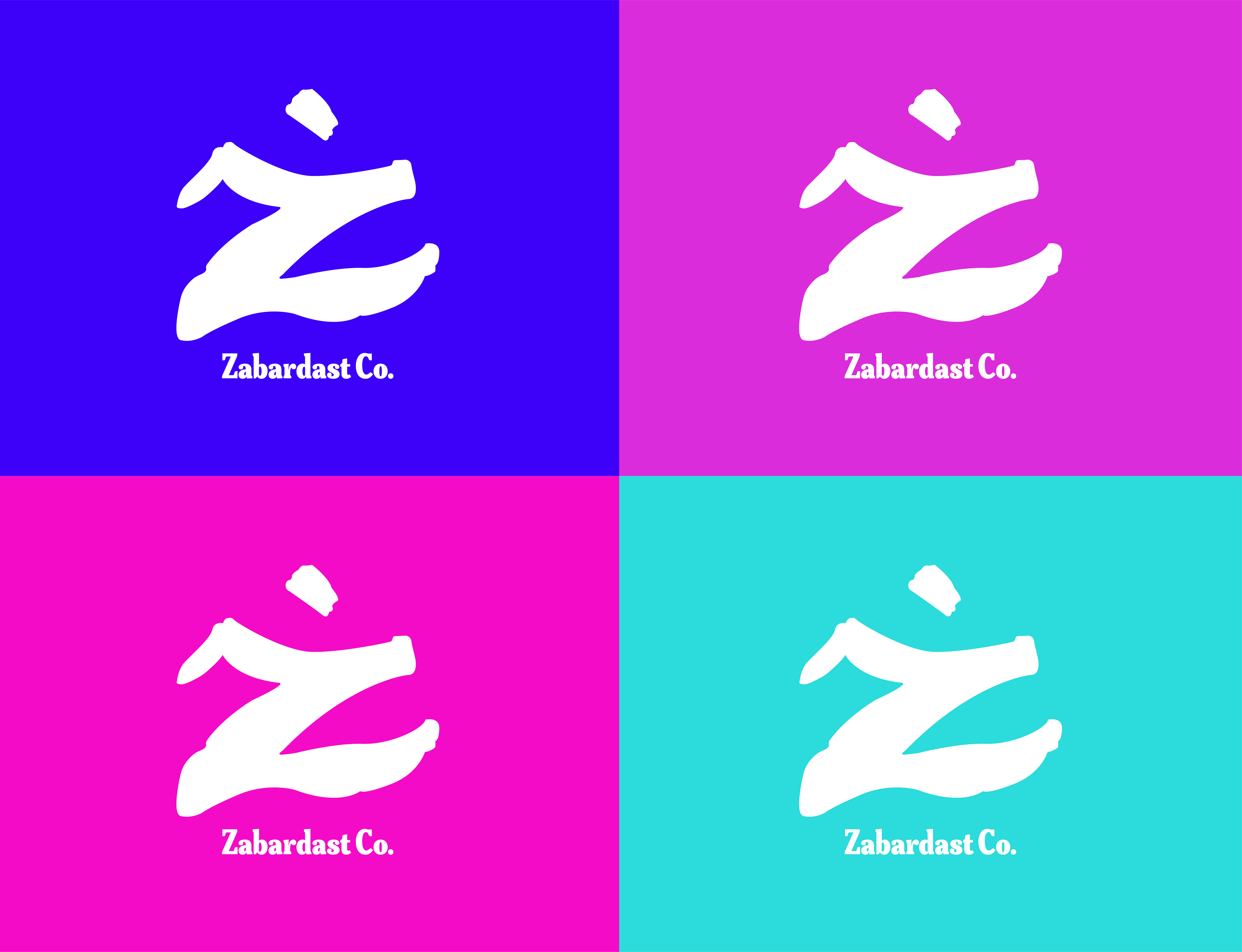
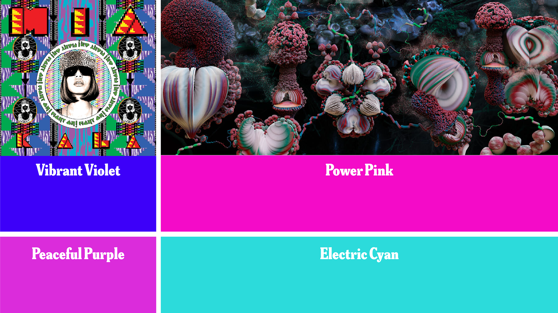
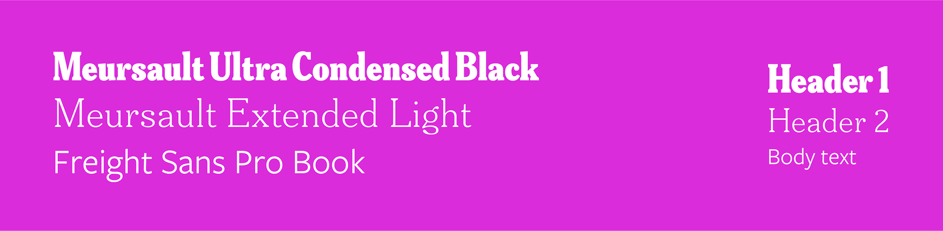
The brand of Zabardast Co. is a flexible identity with various uses, embracing the spirit of experimenting that is so evident in our work. Inspiration from the calligraphic forms of Arabic and Urdu were used for inspiration, so the typeface does not adhere to English standards of how letterforms would, typically, sit neatly on a baseline, or have uniform ascenders.
“Find out who you are, and do it on purpose.” - Dolly Parton
The typeface’s style references the protest art of the Aurat March (The Women’s March) in Pakistan. Additionally, the decision to not use a font was enforced by the constant inspiration found across the Asian diaspora, that is plentiful of meticulous, hand-crafted designs. M.I.A. 's self-titled artbook was a big inspiration for branding that did not want to feel like it was of one country, but the globe. As well as a recurring source of inspiration: Björk.
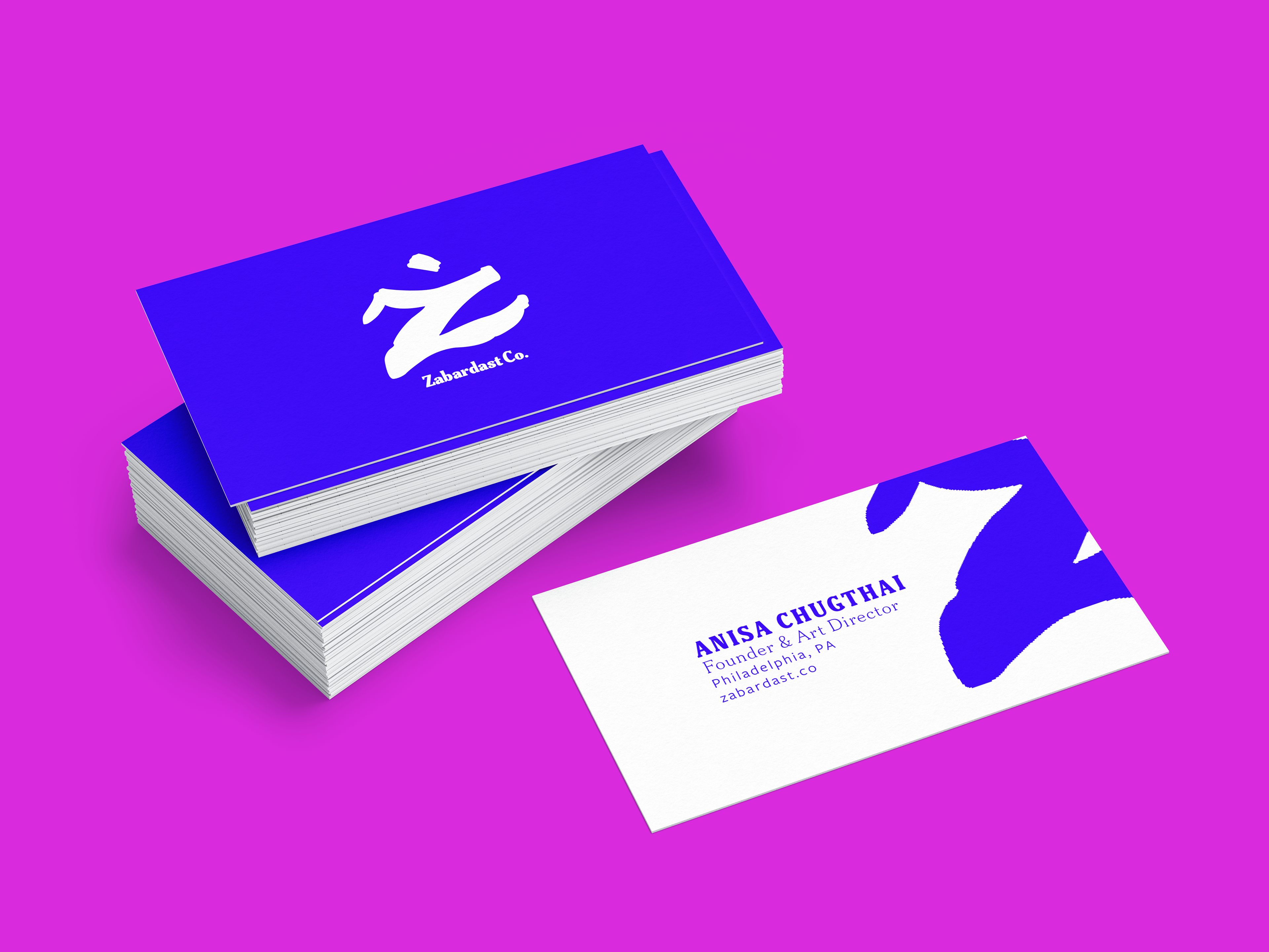
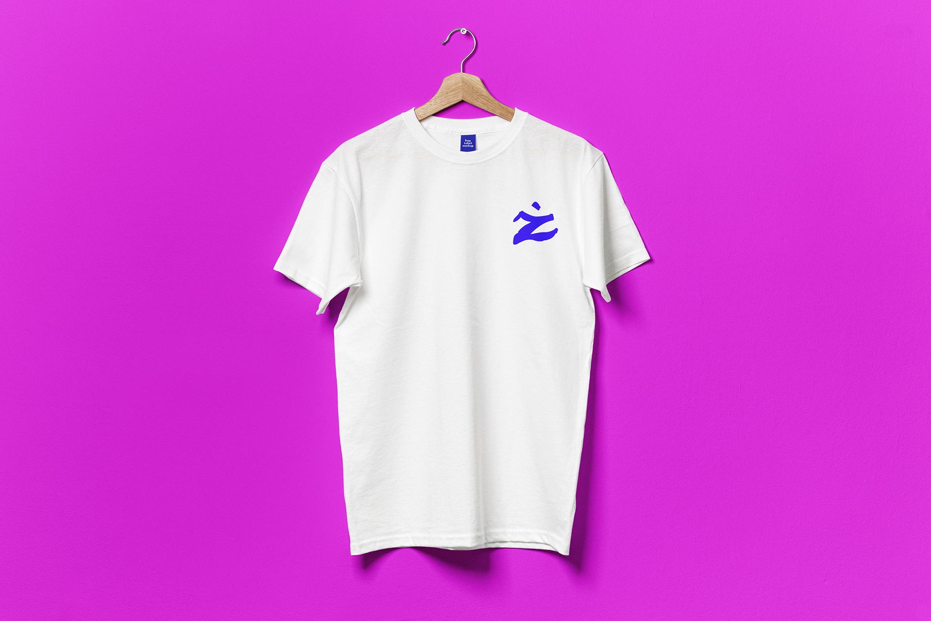
The experimental identity will translate to various forms of apparel, and posters.